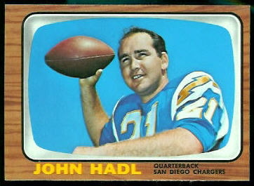
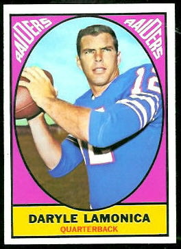
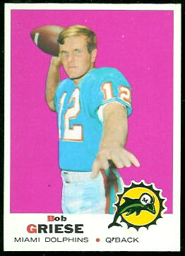
The New Orleans Saints Hall of Fame

January 6th, 2011  |  Published in Halls of Fame

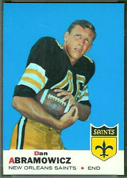
Today I identified the members of the New Orleans Saints Hall of Fame in the Vintage Football Card Gallery. Pictured here are cards of the first two members, Archie Manning and Dan Abramowicz, who both were inducted in 1988. Manning is on his 1972 Topps rookie card, and Abramowicz is on his 1969 Topps rookie card.
Archie Manning 1972 Topps rookie football cardDan Abramowicz 1969 Topps rookie football card
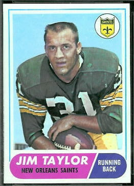
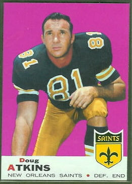
While researching Saints Hall of Fame players, I found something interesting: according to several web sites, including the Pro Football Hall of Fame site, the Saints have retired Jim Taylor’s number, 31. Taylor played only one season for the Saints, however, and he is not a member of their Hall of Fame. The team also retired Doug Atkins’s number, though Atkins was a Saint for only three seasons. It appears that someone in charge was in a hurry to retire numbers. (Taylor is shown here on a 1968 Topps card, though he retired before the 1968 season. Atkins is shown here on his 1969 Topps card.)
Jim Taylor 1968 Topps football cardDoug Atkins 1969 Topps football card
You can see the full list of Saints Hall of Famers on the team’s web site.

Tags: , , , , , , , ,

Still More of My Favorite Pose

December 13th, 2010  |  Published in Uniforms

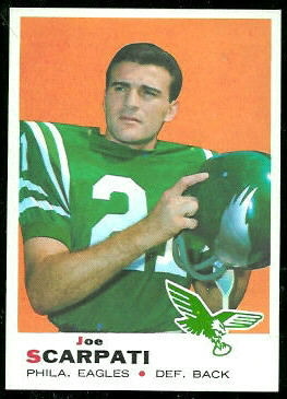
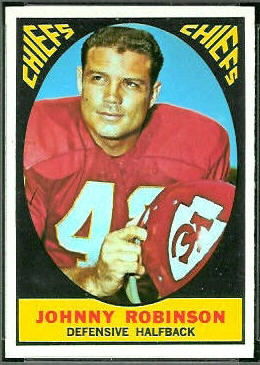
Here is one last group of players in my favorite pose, about to put on their helmets. (For more of these, see My Favorite Pose and More of My Favorite Pose.)

This time we have a 1969 Topps Joe Scarpati and a 1967 Topps Johnny Robinson:
Joe Scarpati 1969 Topps football cardJohnny Robinson 1967 Topps football card
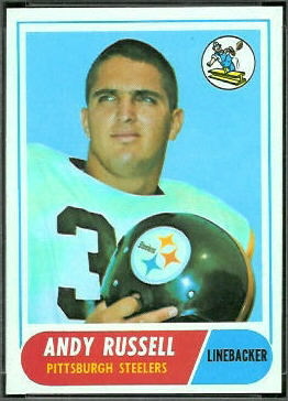
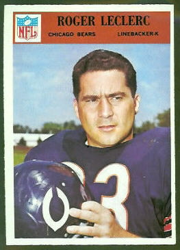
A 1968 Topps Andy Russell rookie and a 1966 Philadelphia Roger LeClerc:
Andy Russell 1968 Topps rookie football cardRoger LeClerc 1966 Philadelphia football card
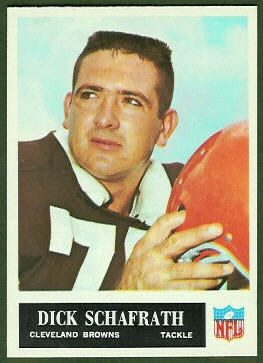
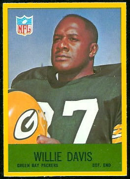
A 1965 Philadelphia Dick Schafrath and a 1967 Philadelphia Willie Davis:
Dick Schafrath 1965 Philadelphia football cardWillie Davis 1967 Philadelphia football card
Unfortunately, the photographers from many teams–notably the AFL teams–never used this pose, so in this series I could feature cards from only about half the teams. That’s a pity: I love Pat Patriot and Denver’s drunk Bronco, and it would have been nice to include them.

Tags: , , , , , , , , , , ,

Holy Golden Triangles, Batman!

May 9th, 2010  |  Published in Uniforms

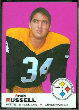
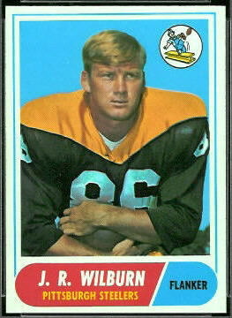
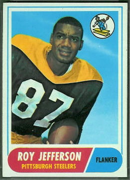
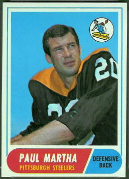
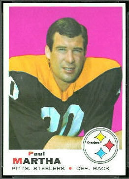
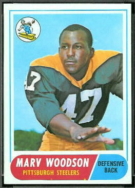
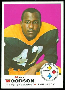
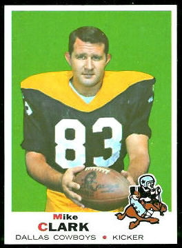
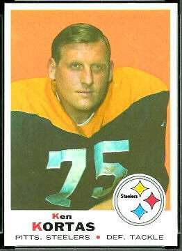
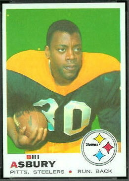
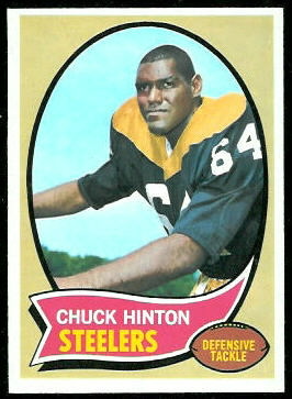
1969 Topps Andy Russell football cardI was looking through some 1968 and 1969 Topps football cards yesterday, and the Steelers’ “Batman” jerseys caught my eye. Looking at the Steelers cards together, I wondered if the Batman jersey photos had all been taken in the same session. It’s possible: I did some Googling and found that the Steelers wore the jerseys for only a season and a half, from the middle of the 1966 season to the end of 1967. My guess is that the photos were all taken before the 1967 season.

An article on team’s web site recounts the full story, but the gist is that, in the midst of the 1966 season, the Steelers decided they wanted their uniforms to be more distinctive. To achieve this, they incorporated a “golden triangle” into their jerseys. This was meant to represent Pittsburgh’s downtown, called the Golden Triangle because it sits between two rivers that give it a triangular shape. (A nice photo I found on Wikipedia shows the triangle.) According to Wikipedia, the players didn’t like the uniforms, because they thought the jerseys looked like Batman’s bat-suit. In 1968, the team reverted to a more standard uniform design, which you can see on 1968 KDKA Steelers cards. Too bad, I think. I kind of like the caped look.

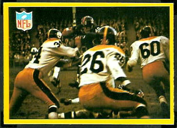
1967 Philadelphia New York Giants play football cardOddly, though the Steelers were wearing the Batman uniforms going into the 1967 season, the uniforms appear on only one 1967 Philadelphia football card, the Giants Play card shown here. This card shows the Giants and Steelers in their December, 1966, game in New York. All of the 1967 Philadelphia cards of individual Steelers, however, show them in older uniforms. The Batman jerseys didn’t appear on cards of individual Steelers until the 1968 Topps set, after the team had stopped wearing them. The jerseys also appeared on several 1969 Topps cards, and on one 1970 Topps card, Chuck Hinton.

Along with the 1969 Topps Andy Russell card above, here are all of the cards I found that picture players wearing Batman jerseys. Click on any card to get the details about it. There are also a few photos of the Batman uniforms–including a great team shot–on UniWatch’s 1966-67 Steelers flickr page.
1968 Topps J.R. Wilburn football card1968 Topps Roy Jefferson football card1968 Topps Paul Martha football card1969 Topps Paul Martha football card1968 Topps Marv Woodson football card1969 Topps Marv Woodson football card1969 Topps Mike Clark football card1969 Topps Ken Kortas football card1969 Topps Bill Asbury football card

Tags: , , , , , , , , , ,

More of My Favorite Pose

May 8th, 2010  |  Published in Uniforms

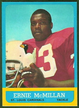
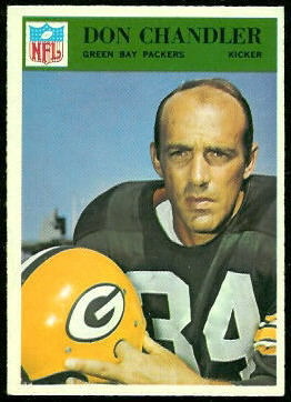
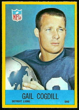
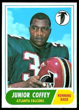
As I’ve written before, my favorite pose on a football card pictures the player about to put on his helmet. It’s fun seeing old helmets on cards, but if the players are wearing them, you can’t see their faces. Here are a few examples; for more, see an old post, My Favorite Pose.

1963 Topps Ernie McMillan and 1966 Philadelphia Don Chandler:
1963 Topps Ernie McMillan football card1966 Philadelphia Don Chandler football card
1967 Philadelphia Gail Cogdill and 1968 Topps Junior Coffey:
1967 Philadelphia Gail Cogdill football card1968 Topps Junior Coffey football card
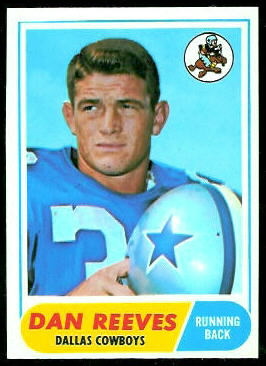
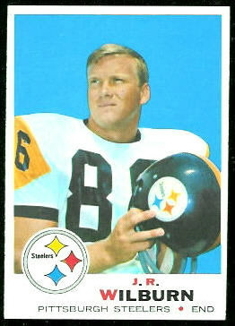
1968 Topps Dan Reeves and 1969 Topps J.R. Wilburn:
1968 Topps Dan Reeves football card1969 Topps J.R. Wilburn football card

Tags: , , , , , , , , , ,

Trivia Question #7

March 4th, 2010  |  Published in Trivia Questions

We haven’t had a trivia question in a while. Feeling smart today?

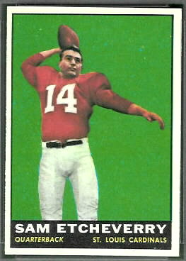
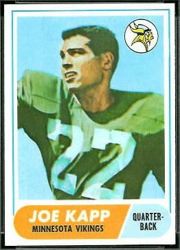
Question #7: What do the four players pictured here have in common?

Scroll down slowly; the answer is after the sponsored links. For more information on a card, click on it or hold your cursor over it.


Sponsored Links


Answer: They are all members of the Canadian Football League Hall of Fame.

Here are their bios on the CFL Hall of Fame web site:


Tags: , , , , , ,

T is for Topps, Part 3: 1964-1969

February 12th, 2010  |  Published in ABCs of Vintage Football Cards

In 1964, the Philadelphia Gum Company obtained the rights to print cards of NFL players, and they did so from 1964 to 1967. (See P is for Philadelphia.) For those four years, Topps switched to printing cards of AFL players. The cards that the two companies produced reflected the images of the leagues: Philadelphia’s NFL cards were conservative and consistent, and Topps’s AFL cards were colorful and innnovative.

In 1968, after the NFL and AFL agreed to merge, Topps obtained the rights to both leagues, and Philadelphia stopped printing football cards. Topps closed out the decade with two colorful sets containing both NFL and AFL players.

1964 Topps

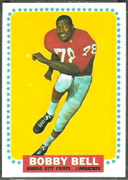
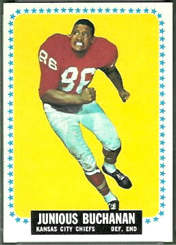
The 1964 Topps set contains 176 cards, a large number for only eight AFL teams. 166 are cards of individual players (the others are team cards and checklists), so there are 20 or 21 player cards for each team. At the time, that was about twice the usual number of players per team, so Topps was able to include more cards of non-stars than usual. Give or take a card or two, there are 73 rookie cards in the set! Among the rookie cards are these bookend Hall of Famers, Bobby Bell and Buck Buchanan of the Kansas City Chiefs.

The 1964 Topps cards have colored backgrounds and colored stars around the borders. I don’t see a pattern to the colors Topps chose for the backgrounds, except that each card has a background color different from the player’s jersey color. Most of the cards have the player’s name, position, and team in white letters on a black background, but a handful–such as the Bobby Bell card–have either white-on-blue or white-and-black-on-red labels. If there is any significance to the alternate label colors, I don’t see it.

The 176 cards in the 1964 set would have been printed on two 132-card sheets, with 88 cards repeated. That means that there are either 88 double prints or 88 short prints in the set, depending on whether your glass is half-full or half-empty.

There is one mistaken identity in the 1964 Topps set: Ray Abruzzese’s card actually pictures Ed Rutkowski. Topps evidently was focused on spelling his name correctly.

1965 Topps

I described the classic 1965 Topps set in J is for Joe Namath–and the 1965 Topps Tall Boys, so I won’t cover it again here. On to 1966…

1966 Topps

In 1966, Topps used the “little television” design previously seen on 1955 Bowman baseball cards and on the highlight cards in the 1961 Topps football set. I imagine that by the third time around, it had lost its cuteness. (I noticed today that even the checklists in the 1966 Topps set are in the shape of TVs.)

Though the Dolphins joined the AFL in 1966 and were included in this set, Topps reduced the set size to 132 cards. They also wasted one on the Funny Ring Checklist. Because of the reduced set size, there are only 13 rookie cards in the set, and there are no Hall of Famers among the rookie cards. I’d call the set a letdown after 1965.

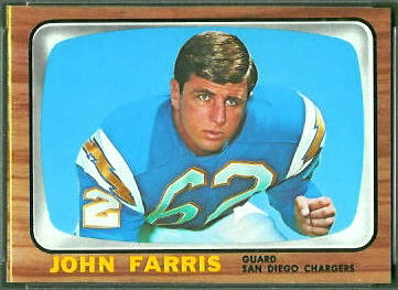
So, what’s interesting about the 1966 Topps cards? Well, the brown borders show wear easily, so finding high-grade cards is a challenge, and challenges are always fun. Also, some cards, such as the John Farris card shown here, can be found with a stripe along one edge. (I’ve seen yellow, red, and black stripes.) The stripes don’t seem to affect the grades that PSA assigns the cards, but to me they’re distracting, and I prefer cards without them. I presume that cards with a stripe were on the edge of the sheet, but I have not seen an uncut sheet to verify that.

Since the set fit perfectly on a 132-card sheet, none of the cards are short prints. The backs of some cards are white, and the backs of others have a yellowish-brownish tone, suggesting that some sheets were printed on different paper stock than others. Here again, I prefer cards with white backs to those with toning, but PSA does not appear to discriminate.

1967 Topps

In 1967, Topps returned to bright colors, and 1967 Topps football cards resemble some of the psychedelic art of the time. (The Peace poster shown here is from cafepress.com.) This is another 132-card set with no short prints, no Hall of Fame rookie cards, and no real oddities. I think, though, that it captures the spirit of the AFL and the country better than any of the other 60s sets.

As I wrote in an earlier article, 33 of the 1967 Topps football cards were reprinted in 1969 for a Milton Bradley game called Win-A-Card. The backs of the Milton Bradley cards have a slightly lighter color than the regular cards (yellow v. orange), and some of them, along their borders, show parts of other cards that were included in the game–such as 1968 Topps baseball cards.

1968 Topps and 1969 Topps

As I said at the top, the 1968 Topps and 1969 Topps sets contain both NFL and AFL players. Topps made these sets bigger to accommodate the larger number of teams, and it released each set in two series. Like most of the Topps cards of the 60s, the 1968 and 1969 sets are colorful and bright.

For more detailed information on these sets, see my virtual uncut sheet pages. Here are the links:

More of the ABCs:

Tags: , , , , , , , , , , ,

S is for Scratch-Offs

January 9th, 2010  |  Published in ABCs of Vintage Football Cards

In the 1950s and 1960s, when the card companies were still marketing to kids, they tried to make the cards interactive and fun to play with. They made cards you could punch out and stand up, they put puzzles on the backs of the cards, and they inserted stamps, stickers, and decals into the packs with the regular cards. They also liked to put scratch-off cartoons and quizzes on the card backs.
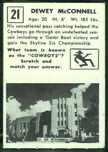
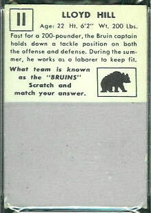
1951 Topps Magic cards were the first football cards with scratch-off backs, the scratch-offs accounting for the “magic” in the name. The material Topps used for the scratch-offs was similar to that used on today’s lottery tickets: a silver-gray coating that crumbled off when you scratched it. Scratching off the crumbly coating revealed a picture of the player’s school, along with the school’s name. The feature apparently was a hit, because most 1951 Topps cards I see have been scratched.
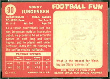
The next football cards with scratch-off backs were 1958 Topps cards. Topps used a different material this time, a white substance that revealed a gray picture when rubbed, but that didn’t come off of the card. All of the player cards in the set had scratch-off backs, but, as shown on this Sonny Jurgensen rookie card, the questions and answers were not about the players on the cards. Even now, I’m disappointed.

Unlike the 1951 Topps cards, most of the 1958 Topps cards I see have not been rubbed. Perhaps it’s because the pictures were not as clear as on the 1951 cards. Or perhaps scraping the little silver-gray pellets onto the floor had been part of the fun. For whatever reason, after 1951, the magic was gone.
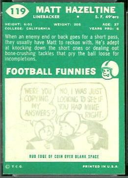
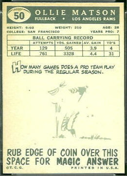
The scratch-offs on 1959 Topps football cards were also unrelated to the player, but they differed a bit from 1958. Part of the picture on each card was visible before rubbing, and you rubbed the card to reveal the rest. Maybe Topps exposed part of the picture to entice kids to rub the card, but I don’t see many 1959 Topps cards that are rubbed, either. To my knowledge, this was the only set in which parts of the pictures were already showing.
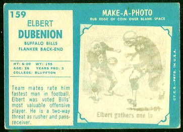
The backs of player cards in the 1960 Topps football set also had scratch-offs, but this time there were no questions and answers, just “Football Funnies” cartoons. I have just one rubbed card, the Matt Hazeltine card pictured here, and the cartoon on it isn’t even related to football. I know they were selling to kids, but I think Topps should have just printed the players’ stats, instead.

Topps persisted with the scratch-offs in 1961. Rubbing the back of a 1961 Topps card revealed a generic cartoon of a player in action, labeled with the name of the player on the card. Though the cartoons were generic, Topps at least took care to get the players’ numbers right. Elbert Dubenion, whose card is shown here, indeed wore number 44.

After 1961, Topps took a break from scratch-offs, instead simply printing cartoons on the card backs. The Philadelphia Gum Company picked up the slack, using the scratch-off feature on their cards in 1965 and 1967. Scratching a 1965 Philadelphia card revealed a picture of one player, and the name of another. To find the name of the pictured player, the card back directed you to a different card, which had the answer. This was a bit convoluted for a kid, I’d say. Philadelphia dispensed with the scratch-offs in 1966, but retained the picture-on-one-card, name-on-another quiz.
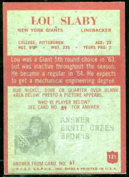
In 1967, Philadelphia again put scratch-offs on their cards, but this time they used simple questions and answers related to the player on the card. I don’t know how well the scratch-offs worked back then, but I recently rubbed the Dale Hackbart card shown here, and I can barely see the answer. (It’s “He teaches school.”)
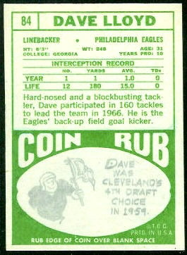
Topps returned to scratch-offs in 1968, but they didn’t put them on every card. Only about 20% of the cards have the “Coin Rub” on the back, and the other 80% have cartoons about the players printed on them. I imagine that limiting the number of scratch-offs was a cost saving measure: someone at Topps wanted the scratch-offs, and someone else said “Why? The kids don’t scratch them, anyway.” And so they compromised. Rubbing the Coin Rub backs reveals cartoons like those on the other cards.

Cards with Coin Rub backs appear in both series of 1968 Topps cards. I thought that Topps might have arranged the Coin Rub cards in a pattern on the uncut sheets–perhaps all in the same row or column, for instance–but they appear to have scattered them randomly on the sheets.
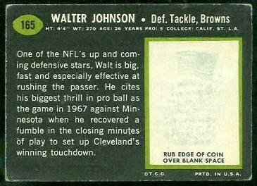
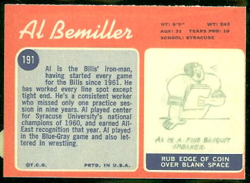
In 1969 and 1970, Topps again put scratch-offs on only a small number of cards. As in 1968, the scratch-offs revealed cartoons about the players, like those on the other cards. In 1969 and 1970, though, the scratch-offs appeared only in the second series of each set. Perhaps this was an effort to boost interest in the second series, after kids had burned themselves out trying to complete the first series. To my knowledge, 1970 Topps is the last set containing cards with scratch-off backs.

Considering how few scratch-offs actually got scratched after 1951, I am surprised that Topps put them on cards for as long as they did. Maybe they assumed that kids were busy scratching them, and didn’t know otherwise until years later, when old cards started coming out of attics. Collectors today don’t appreciate the scratch-offs, either: customers often ask me whether the backs of cards I am selling have been scratched.

I am also surprised, considering collectors’ aversion to scratched cards, that PSA is not harsher when grading them. I often see PSA 7s that have been rubbed, and the 1958 Topps Sonny Jurgensen card above is a PSA 8 OC. To me, a rubbed card ought to grade excellent at best, since an exposed cartoon is certainly more distracting than, say, a quarter-inch hairline crease. What do you think?
Tags: , , , , , , , , , , , ,

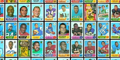
New in the Gallery: 1968 Topps Virtual Uncut Sheets

December 30th, 2009  |  Published in New in the Gallery

Yesterday I put together more virtual uncut sheets, this time for 1968 Topps football cards. Again you can see that cards on the corners and edges of the sheets are the toughest to find in high grade.

(Click on the image to see the sheets.)

Tags: ,

The Best Value in Vintage Sports Cards?

October 15th, 2009  |  Published in General Collecting Info

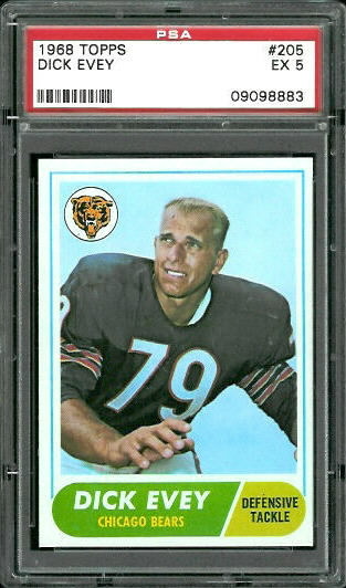
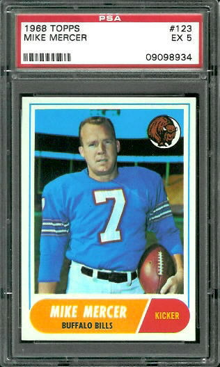
Pictured here are two cards I listed for sale yesterday, both 1968 Topps cards graded PSA 5. Each of them has a tiny hairline crease that I had to use a magnifying glass to see. If not for the hairline creases, my guess is that PSA would have graded both cards 8 or 9.

To me, graded 5’s like these are the best value in the hobby. Typically, a card graded Excellent has a problem that you can see from a few feet away: worn corners, serious printing problems, horrid centering, obvious surface wear. Cards like the ones pictured, though, look perfect until you tilt them in the light and perhaps use magnification. And, being 5’s, they sell for a small fraction of what an 8 or a 9 would sell for.

I’m not sure where the hobby’s aversion to creases came from, but even the faintest half-inch crease on the back of a card is a killer for a card’s grade. Have collectors always downgraded cards so harshly for the faintest of creases, and the grading companies just incorporated that harshness into their standards? Or was it the grading companies who decided that any crease, no matter how faint, is devastating to a card’s value, and collectors just accepted that?

As I wrote in G is for Grading, your personal tastes can differ from the grading companies’ standards. When they do differ, it can present opportunities for bargains on cards that you find perfectly attractive. To me, the biggest bargains are cards with tiny, faint creases–especially on the back. On some cards, such as the old Bowmans, it’s actually sometimes hard to distinguish light creases from lines that occur naturally in the paper.

Tags: , ,

2010 Pro Football Hall of Fame Senior Candidates

September 8th, 2009  |  Published in Halls of Fame

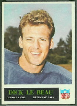
Dick LeBeau and Floyd Little were recently named the 2010 senior finalists for induction into the Pro Football Hall of Fame. The Hall of Fame site provides biographies for the two stars and describes the process for choosing the senior nominees.

LeBeau’s rookie card is a 1965 Philadelphia, pictured here. Like many defensive stars, LeBeau played several years before a card company decided to print a card of him. LeBeau entered the NFL in 1959, and he finally got his rookie card in his seventh season.

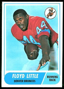
Little’s rookie card is a 1968 Topps, released in his second year. Little appeared on a lot of cards in his career, including four in the 1972 Topps set alone.


Judging by recent history, it is likely that at least one of the two senior nominees will be elected to the Hall. The Hall of Fame’s senior nominees page shows that at least one senior candidate has been elected each year since 1998. Since 2004, when the senior committee began nominating two players per year, nine of the twelve nominees have been elected. One, Bob Hayes, was not elected in 2004, but he was given a second chance and elected in 2009.

Tags: , , ,