You can’t talk about vintage football cards without talking about Topps. Topps printed football cards in 1950, 1951, and every year from 1955 until 2009. Earlier this week, I was a little apprehensive about writing this post, since that’s a ton of sets to cover. Then I realized that since I run this place, I can split the topic up however I want!
Since this is a vintage football card blog, I’ll cover the Topps sets until the mid-1970s. That still leaves over twenty sets to talk about, so I’ll break them down further and do just a few years at a time. This is part one, the 1950s.
 1950 Topps Felt Backs were Topps’s first football cards. They left nowhere to go but up. The Felt Backs are homely little suckers, especially when compared to Bowman’s attractive 1950 set. (See B is for Bowman.) You can see most of the 1950 Felt Back set in the Vintage Football Card Gallery.
There are a few sources of information about the Felt Backs on the ‘net: An article on the PSA web site has a description of the set, but no pictures. (I assume the author of the article, Staff Writer, has left the company.) The Redskins Card Museum has nice pictures, both front and back, of the Redskins Felt Backs. The Topps Archives Blog has a picture of a window display for the cards, and a picture of a birthday card with a Felt Back pack attached. The birthday card is kind of cool, and there were birthday cards like it that had other toys attached, such as balloons.
I do like one thing about the Felt Backs: the whimsical adjectives describing some of the players. James Murphy is a “deft passer and quarterback.” Bimbo Cecconi is a “blazing halfback.” Bob Bucher is a “tough guard.” And so on. And the little pennants on the back are interesting. Who knows, maybe the cards will grow on me.
 Topps’s next offer, 1951 Topps Magic, was more standard than the Felt Backs, but still innovative. As I wrote in S is for Scratch-Offs, the magic part of the cards was the scratch-off section on the back. Most of the cards I see have been scratched, and unscratched cards carry a premium, price-wise.
Like the 1950 Felt Backs, the 1951 Magic set featured college players. Several of the players–Bill Wade, Babe Parilli, and Marion Campbell, for example–went on to have long pro careers, and they appeared on numerous cards in later years. Parilli had the longest career of any of them, playing nineteen seasons for six NFL, CFL, and AFL teams!
After 1951, Topps took a break, and Bowman continued to print cards of NFL players. When Topps returned, in 1955, they produced the 1955 Topps All-American set. This classic and popular set has its own place in the ABC’s, so I won’t discuss it here. See A is for All-Americans.
 In 1956, after buying out Bowman, Topps was finally able to print cards of NFL players. Sandwiched between the 1955 All-Americans and the equally classic 1957 set, the 1956 Topps set is somewhat overlooked. I like the cards, though. As I wrote in B is for Bowman, the 1956 Topps cards have elements of both the Topps and Bowman issues from 1955. Like the 1955 Bowmans, they have colored backgrounds and auras around the players, and like the 1955 Topps All-Americans, the have the team name and logo in a little box on the front.
The 1956 Topps cards are also the same size as 1955 Bowman and Topps cards. 1956 was the last year Topps printed cards in this large size, though. To my knowledge, except for the 1965 Topps “tall boys,” all of the Topps sets since 1956 have been the smaller standard size. I assume they made the change to save cardboard.
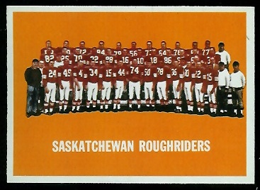
 The 1956 Topps set was the first to include team cards, a nice feature. To my knowledge, it’s also the only set that identified the players on the team cards. I wish all sets did. I sell a lot of team cards to friends and families of the players, especially players who did not appear on cards of their own. Because the images of the players are small on team cards, it is sometimes hard to tell the players apart.
 As I mentioned above, the 1957 Topps set is another classic. Like the 1955 All-Americans, 1957 Topps cards have both a portrait and an action shot, a design that collectors find appealing. (Topps would use it again in their 1962 set, another popular issue.) There are six rookie cards of Hall of Famers in the 1957 set, including Bart Starr and John Unitas, the league’s premier quarterbacks for the decade to follow.
1957 Topps was the first football card set to be released in two series. Most of the second series cards are scarcer than cards in the first series, and many are poorly centered. The challenge of finding the cards in high grades, combined with the attractive design and big names in the set, make the 1957 Topps set fun to collect.
 In 1958, Topps took a step backward, in my opinion. The 1958 Topps cards are darker than in 1957, and their images are not as clear. The dark colors–such as the black on Jim Brown’s rookie card–tend to show snow and scuffing, as well. And I think the “matting” covers too much of the images: the effect is like looking at the players through a telescope, or a knothole.
The 1958 Topps set is also smaller than its predecessor: 132 cards, released a single series. To me, it is like the 1953 Bowman set, a letdown after a classic. Unlike the 1953 Bowman set, it has a couple of key rookie cards–Brown and Sonny Jurgensen–and those are the cards that save it.
 Rounding out the decade is the 1959 Topps set, a return to bright, colored backgrounds, and two series of cards. For a fun summary of the set, see T.S. O’Connell’s article on the Sports Collector’s Digest web site. For a discussion about some of the cards that are tougher to find, see my virtual uncut sheet page for the 1959 Topps set. I can’t add much to what’s written on those pages, so I’ll just let you check those out.